Iterative.Design.
In this learning outcome, I'll show how I went through an iterative process to make my work better.
I made several changes based on feedback from surveys and direct suggestions from a teacher.
In this learning outcome, I'll show how I went through an iterative process to make my work better.
I made several changes based on feedback from surveys and direct suggestions from a teacher.
In the branding assignment, we made a branding for the sound lab at Fontys.
The stakeholder had a problem: the SoundLab was not well-known among students,
and he wanted it to be used more.
So, we created a brand for the Fontys Sound-Lab

When I got the assignment, I started making different variants of logos which you can see here. I wrote the design choices and the feedback I got from Josh down in a document. I showed these logos to Josh, and he told me he liked this one them most ut he told me to make it less childishly chaotic. So then I edited the logo and removed the microphone and speaker.
When I got the feedback from Josh, Here you can read the full design proces including josh's feedback, I started to edit my design, and I edited like this. I removed the speaker and the microphone and moved the line a bit to the left. On the right you see the final design.
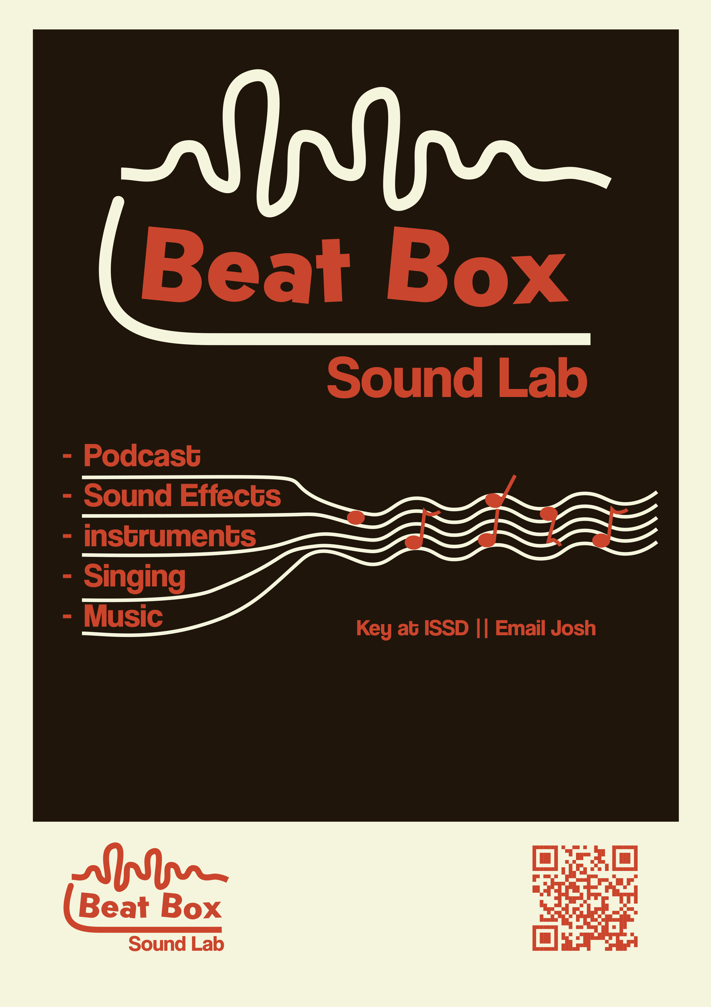
After the logo was chosen, I made a poster for the SoundLab based on the retro/cozy vibe the target audience chose. On the right you see the poster that I made. I used the logo and added the SoundLab text to make it clearer that it is for a SoundLab. I also gave some examples of what the SoundLab can be used for. The sheet music line makes the biggest connection with the SoundLab. The overall poster is like a photo from an instant camera, enhancing the retro feel of the poster. You can find extra information in the same document as logo.
For the Fontys Part-Time website, we made two iterations.
In the group assignment,
we made the website design.
For the development assignment,
we did a user test to check the layout.
Here are answers of the user test.
You can see this in my research document
As you can read in the document,
we first did a user test for the website.
With this feedback,
we made a new design
which you can see here.
We checked this design with a UX expert
as you can read in the document.
Here you can find the final design.
If you want to see the Fontys website live,
you can find it here.
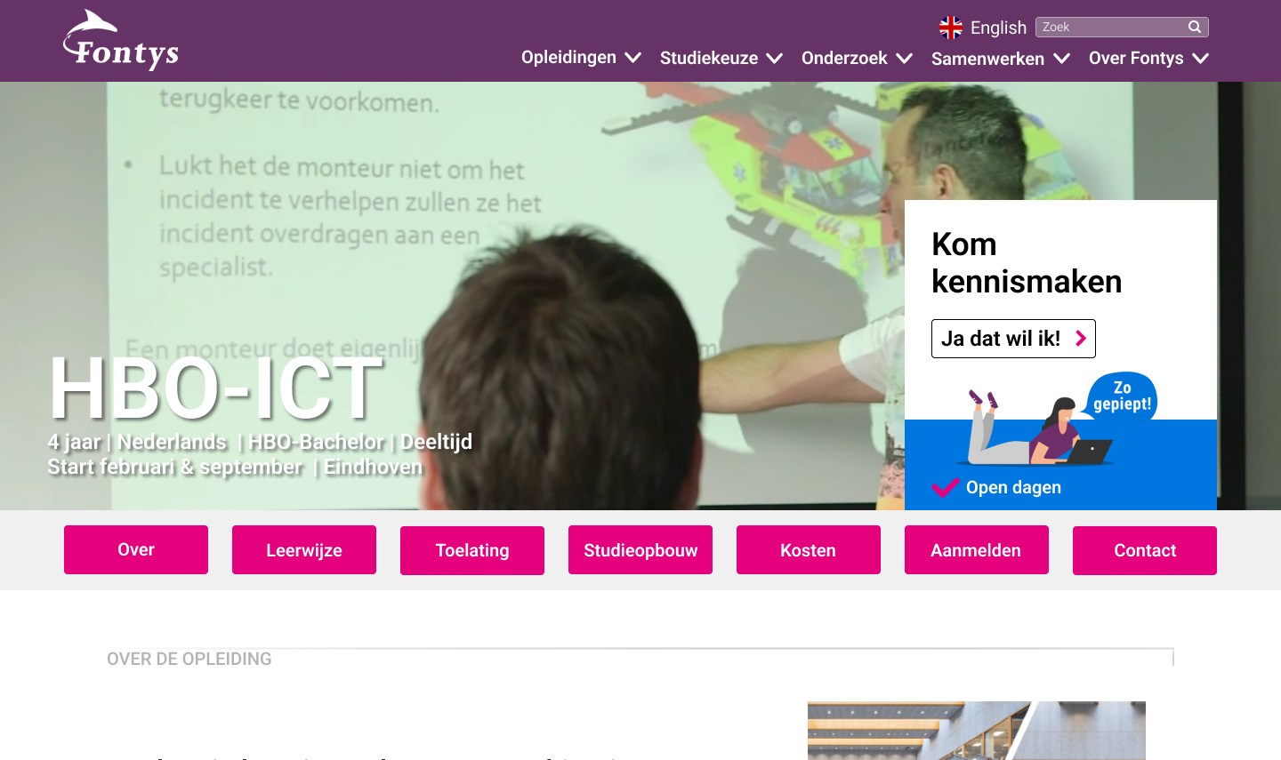
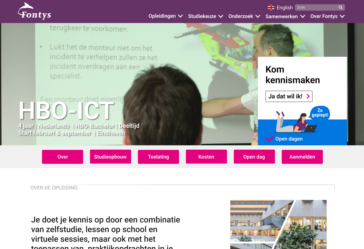
In the second design, we asked a UX expert to check our first iteration., and he told us the labels/navigation buttons where a not very organised he didn't know what the content of some buttons where. We changed the navigation buttons, here you can read more about the proces of the whole project. On the right you see the final design and here is the figma in pdf.
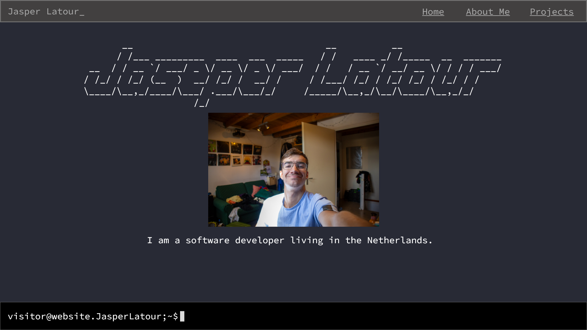
For sprint-X I made a portfolio design and coded a website for Jasper Latour.
Jasper is studies technology he is currently in semester 2. He asked me
if I could make a portfolio website for him,
so he can show his work to other students and companies.
So I started with asking what he wanted his portfolio
to look like and started designing it in Adobe XD.
He told me he wanted a terminal style portfolio.
Where he could navigate through a command line interface (CLI).
Based on this information, I started designing the website.
Which you can see on the right and in the
Adobe XD file.
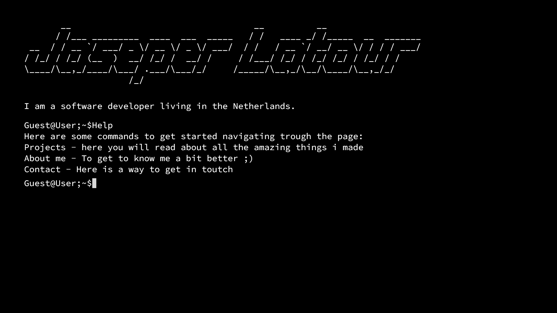
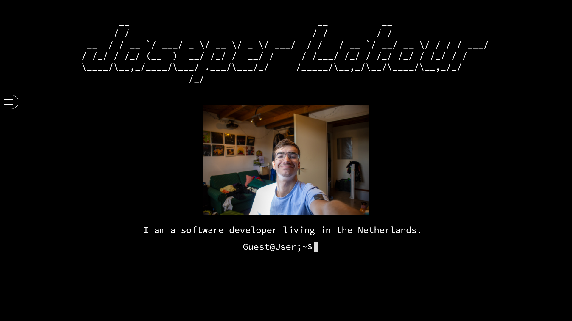
After the first design, I got some feedback from Jasper in the interview I did.
He told me he also wanted other people to be able to navigate through his portfolio.
And he wanted a way to make it more personal, so I added a picture of him.
I also added a small hamburger menu
to make it easier to navigate through the portfolio
if you don't know how to use CLI.
This design is in the same file as the first design.
Adobe XD file.
here you can listen to my interview with Jasper.
After I showed the second design to Jasper.
So I asked him what he wanted to change,
he said that he wanted more like a modern linux terminal,
with the purple and gray colors.
And he found the hamburger menu not fitting with the design.
So I did some research on how I could make a modern linux terminal.
My research can be found in my research document,
Here.
I found the colors linux uses for their terminal.
I also changed the terminal a bit,
so it looks more like a separate part from the rest of the website.
Here you have the interview with Jasper.
And if you want to check out the final website, you can find it at jasper.platour.net.
