Second Design.
After the first portfolio review, I got some feedback about the design.
Here is a file with the feedback and the things I did to improve them:
feedback.
To make it more myself and add some elements to make it a bit less boring,
I added the following elements to my design.
I added a red accent color to my design. This will make it look more luxurious/modern.
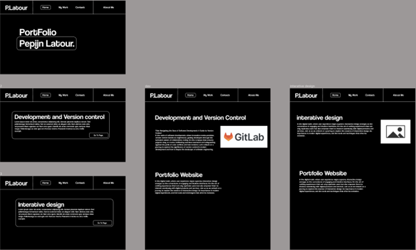
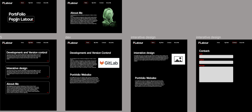
Here is a link to my Figma design: Figma
and here is the .fig file, so you can text the interactive ness of the design:
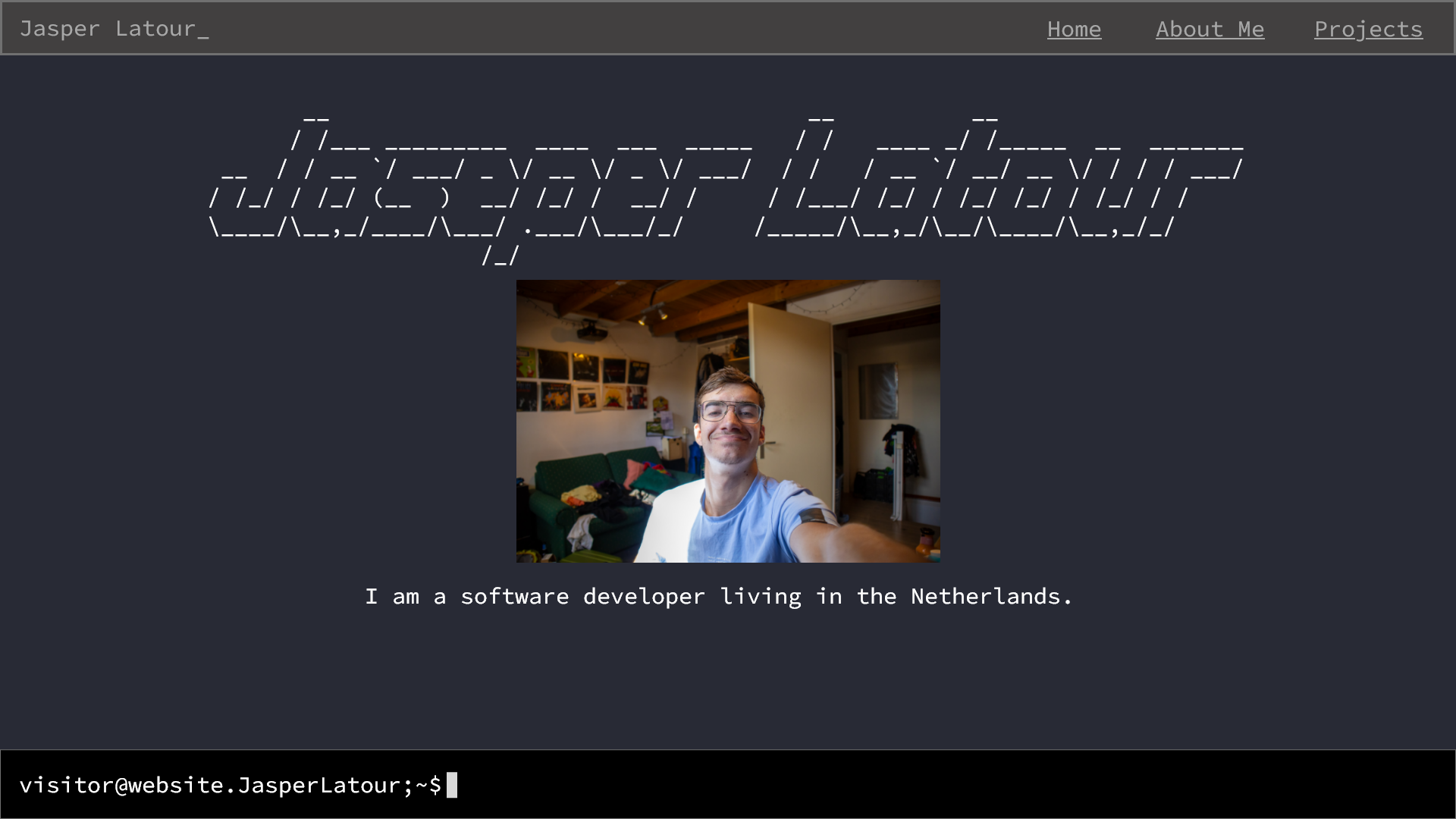
3D.Picture
I added a 3D picture of myself to make my design more memorable. It fits well with the overall style, and I've made it red to match my accent color for a striking look.
And to give the design a personal touch. It blends nicely with the page style. I made the model red to match my accent color, making it really stand out.